Python
World Happiness Report Analysis in Python: 9 Visualizations
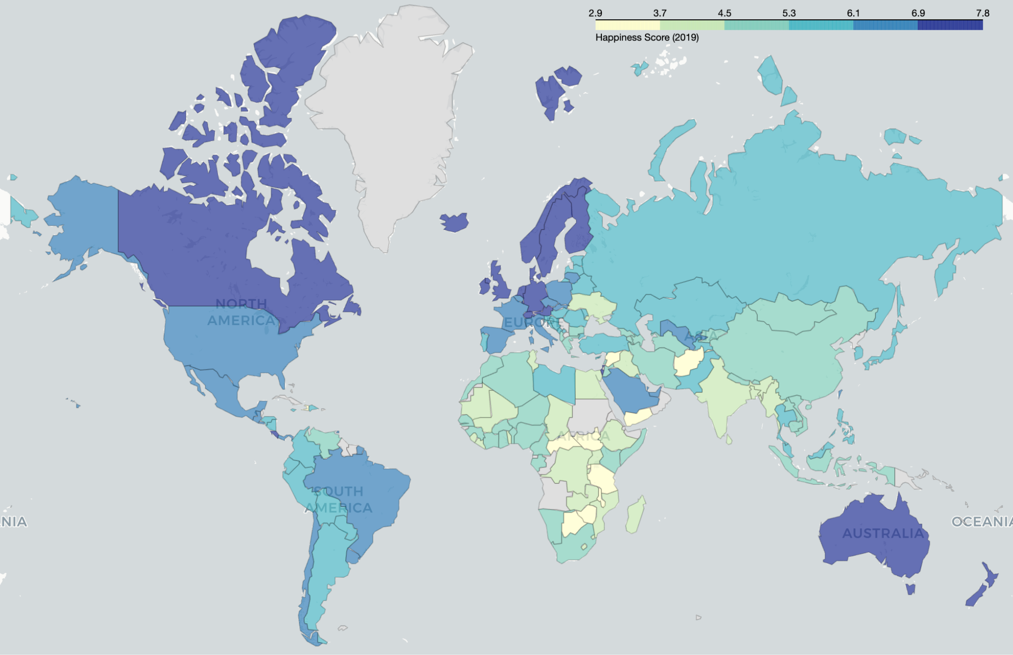
The World Happiness Report 2019 ranks 156 countries by self-reported life satisfaction. Each country carries one happiness score and 6 contributing factors, and this guide analyzes that dataset in Python across 9 visualizations.
The stack stays small: pandas loads and reshapes the data, Matplotlib and seaborn draw the static charts, and Folium renders the interactive world map. pywaffle builds the regional breakdowns.
Two columns in this dataset get misread in almost every published analysis. Freedom to make life choices ranks Uzbekistan first and Somalia fourteenth. Perceptions of corruption assigns Afghanistan a value of 0.025, near the bottom of all 156 countries. Neither column measures what its name suggests. This guide reads both correctly and shows the code behind each reading.
Every figure below comes from the raw CSV, recomputed at runtime.
Dataset Overview
The 2019 dataset holds 156 rows and 9 columns, one row per country. Responses come from the Gallup World Poll, which asks people to rate their own lives from 0 to 10. The file contains zero missing values, so no imputation step applies.
The exact file used for every figure in this guide is available at world-happiness-report-2019.csv, so each result can be recomputed locally.
Here is what each column holds and the range it spans.
| Column | Type | Range in this file | What it holds |
|---|---|---|---|
| Overall rank | int | 1 to 156 | Position by happiness score, descending |
| Country or region | str | 156 unique | Country name as reported by Gallup |
| Score | float | 2.853 to 7.769 | The life ladder rating on a 0 to 10 scale |
| GDP per capita | float | 0.000 to 1.684 | Score points attributed to income |
| Social support | float | 0.000 to 1.624 | Score points attributed to having someone to count on |
| Healthy life expectancy | float | 0.000 to 1.141 | Score points attributed to years lived in good health |
| Freedom to make life choices | float | 0.000 to 0.631 | Score points attributed to satisfaction with personal choice |
| Generosity | float | 0.000 to 0.566 | Score points attributed to recent charitable donation |
| Perceptions of corruption | float | 0.000 to 0.453 | Score points attributed to trust in government and business |
Finland tops the file at 7.769. South Sudan sits last at 2.853. The full spread covers 4.916 points.
The six factors are contributions, not measurements
Each factor column holds an estimated contribution to the happiness score, not a raw measurement. GDP per capita reads 1.340 for Finland, which is not dollars and not a growth rate. It is the portion of Finland’s 7.769 score that the report attributes to income.
This distinction changes how every later chart reads. A high Perceptions of corruption value means more trust, because trust adds points to the score. A low value means the report credits that country with few points from trust.
The six factors also sum to less than the score. That gap has a name and a size.
factors = [
    'GDP per capita',
    'Social support',
    'Healthy life expectancy',
    'Freedom to make life choices',
    'Generosity',
    'Perceptions of corruption'
]

df['sum_six'] = df[factors].sum(axis=1)
df['residual'] = df['Score'] - df['sum_six']

print(round(df['residual'].mean(), 3))
print(round(df['residual'].min(), 3), round(df['residual'].max(), 3))
1.88
0.184 3.05The residual averages 1.880 points and ranges from 0.184 to 3.050. It represents Dystopia plus unexplained variance, a baseline the report adds to every country. The 2019 file omits this as a named column. Any analysis referencing a Dystopia residual column in this specific file references a column that does not exist. Earlier report years ship that column separately.
Loading the dataset
Load the CSV with pandas and confirm the shape before plotting anything.
import pandas as pd

df = pd.read_csv('2019.csv')

print(df.shape)
print(df.isna().sum().sum())

df.head(10)
(156, 9)
0The shape confirms 156 countries and 9 columns. The null count of 0 confirms a clean file.
| Overall rank | Country or region | Score | GDP per capita | Social support | Healthy life expectancy | Freedom to make life choices | Generosity | Perceptions of corruption |
|---|---|---|---|---|---|---|---|---|
| 1 | Finland | 7.769 | 1.340 | 1.587 | 0.986 | 0.596 | 0.153 | 0.393 |
| 2 | Denmark | 7.600 | 1.383 | 1.573 | 0.996 | 0.592 | 0.252 | 0.410 |
| 3 | Norway | 7.554 | 1.488 | 1.582 | 1.028 | 0.603 | 0.271 | 0.341 |
| 4 | Iceland | 7.494 | 1.380 | 1.624 | 1.026 | 0.591 | 0.354 | 0.118 |
| 5 | Netherlands | 7.488 | 1.396 | 1.522 | 0.999 | 0.557 | 0.322 | 0.298 |
| 6 | Switzerland | 7.480 | 1.452 | 1.526 | 1.052 | 0.572 | 0.263 | 0.343 |
| 7 | Sweden | 7.343 | 1.387 | 1.487 | 1.009 | 0.574 | 0.267 | 0.373 |
| 8 | New Zealand | 7.307 | 1.303 | 1.557 | 1.026 | 0.585 | 0.330 | 0.380 |
| 9 | Canada | 7.278 | 1.365 | 1.505 | 1.039 | 0.584 | 0.285 | 0.308 |
| 10 | Austria | 7.246 | 1.376 | 1.475 | 1.016 | 0.532 | 0.244 | 0.226 |
Iceland ranks 4th overall while scoring 0.118 on Perceptions of corruption, a value close to the file mean of 0.111. That single row shows why reading the column as a corruption index produces wrong conclusions.
Top 10 Happiest Countries
The 10 highest-scoring countries in 2019 span 7.246 to 7.769, a range of just 0.523 points. Sort by Score and plot the result as a horizontal bar chart.
import matplotlib.pyplot as plt
import seaborn as sns

top_10 = df.sort_values(by='Score', ascending=False).head(10)

plt.figure(figsize=(10, 6))
sns.barplot(
    x='Score',
    y='Country or region',
    data=top_10,
    palette='viridis'
)
plt.title('Top 10 Happiest Countries (2019)')
plt.xlabel('Happiness Score')
plt.ylabel('Country')
plt.tight_layout()
plt.show()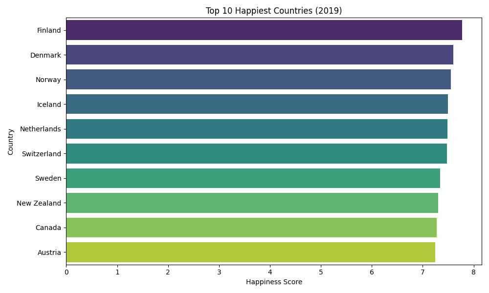
The ranking runs Finland, Denmark, Norway, Iceland, Netherlands, Switzerland, Sweden, New Zealand, Canada, Austria. Eight of the 10 sit in Europe. Six of those eight sit in the Nordic region.
What the top 10 share
The top 10 group posts high values on 3 of the 6 factors and mixed values on the rest.
| Factor | Top 10 mean | Top 10 range | File mean |
|---|---|---|---|
| GDP per capita | 1.387 | 1.303 to 1.488 | 0.905 |
| Social support | 1.544 | 1.475 to 1.624 | 1.209 |
| Healthy life expectancy | 1.018 | 0.986 to 1.052 | 0.725 |
| Freedom to make life choices | 0.579 | 0.532 to 0.603 | 0.393 |
| Generosity | 0.274 | 0.153 to 0.354 | 0.185 |
| Perceptions of corruption | 0.319 | 0.118 to 0.410 | 0.111 |
GDP per capita, social support, and healthy life expectancy all run above 1.5 times the file mean. Generosity separates the group least, at 1.48 times the mean. Finland ranks 1st overall while posting 0.153 on generosity, below the file mean of 0.185.
The spread inside the group stays narrow. Iceland at 0.118 on trust and Denmark at 0.410 sit 3.5 times apart on the same factor, in the same top 10.
Visualizing Happiness Globally
A choropleth map shades every country by its happiness score and exposes regional patterns in one frame. Building it takes 2 steps: reconciling country names against a GeoJSON boundary file, then drawing the layer with Folium.
Step 1: Prepare the data
Country names in the Gallup file differ from the names in the GeoJSON boundaries. Five renames cover the mismatches that matter.
import pandas as pd
import folium
import requests

url = 'https://raw.githubusercontent.com/python-visualization/folium/master/examples/data/world-countries.json'
geo_json_data = requests.get(url).json()

df_map = df.copy()
df_map = df_map.rename(columns={"Country or region": "Country"})

df_map = df_map.replace({
    "United States": "United States of America",
    "Tanzania": "United Republic of Tanzania",
    "Congo (Kinshasa)": "Democratic Republic of the Congo",
    "Congo (Brazzaville)": "Republic of the Congo",
    "Trinidad & Tobago": "Trinidad and Tobago"
}, regex=False)
Skipping this step leaves those countries unshaded on the finished map.
Step 2: Draw the choropleth
Folium binds the score column to the GeoJSON feature names and writes an interactive HTML file.
map_world = folium.Map(location=[20, 0], zoom_start=2, tiles="cartodbpositron")

folium.Choropleth(
    geo_data=geo_json_data,
    name='choropleth',
    data=df_map,
    columns=['Country', 'Score'],
    key_on='feature.properties.name',
    fill_color='YlGnBu',
    fill_opacity=0.7,
    line_opacity=0.2,
    legend_name='Happiness Score (2019)',
    nan_fill_color='lightgray'
).add_to(map_world)

map_world.save('world_happiness_2019_map.html')
Open world_happiness_2019_map.html in a browser to pan and zoom the result.
Regional patterns on the map
The shading breaks into three bands.
- Above 7.0: Northern and Western Europe, Canada, Australia, and New Zealand render in the darkest blue. Eleven countries clear 7.2.
- Below 4.5: Much of Sub-Saharan Africa, plus Afghanistan, Syria, and Yemen, render in pale yellow. Sixteen countries fall below 4.0.
- Between 5.0 and 6.5: Most of South America, Southeast Asia, and Eastern Europe occupy the middle band. Ninety-seven of the 156 countries land between 4.5 and 6.5.
Gray areas mark countries absent from the Gallup file, including Greenland, Western Sahara, and North Korea.
Global Happiness Distribution
The 156 scores cluster tightly around the middle of the scale rather than splitting into rich and poor camps. A histogram with a kernel density estimate makes the shape explicit.
import matplotlib.pyplot as plt
import seaborn as sns

plt.figure(figsize=(10, 6))
sns.histplot(df['Score'], bins=20, kde=True, color='skyblue', edgecolor='black')

plt.title('Distribution of Happiness Scores (2019)', fontsize=14)
plt.xlabel('Happiness Score')
plt.ylabel('Number of Countries')
plt.tight_layout()
plt.show()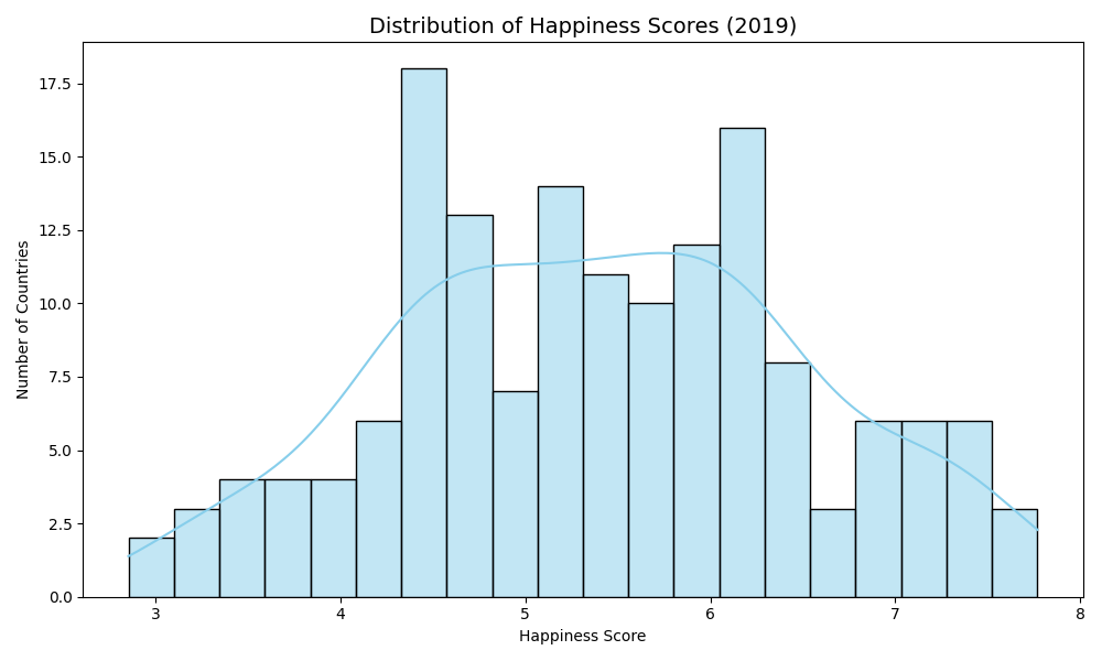
Five readings from the distribution
- Range: Scores run from 2.853 to 7.769, a spread of 4.916 points.
- Center: The mean sits at 5.407 and the median at 5.380, a gap of 0.027 points.
- Bulk: Ninety-seven countries score between 4.5 and 6.5, which is 62.2 percent of the file.
- Tails: Eleven countries clear 7.2 and 16 fall below 4.0.
- Shape: Skewness measures +0.011, which describes a near-symmetric distribution rather than a skewed one.
The near-zero skew matters for interpretation. Many published analyses of this file describe a left-skewed distribution. Running df['Score'].skew() returns 0.011, and the mean and median differ by less than 0.03 points.
Why the distribution sets a baseline
The distribution converts any single score into a percentile. A country scoring 5.9 sounds mediocre against a 10-point ceiling. Against this file, 5.9 ranks 54th of 156, placing it in the top 35 percent.
The same logic supports threshold work later. Splitting the file at the quartiles produces defensible low, medium, and high bands, because the underlying shape is symmetric.
Factor-Wise Comparison Using Lollipop Charts
Three of the 6 factors carry no direct economic component: freedom to make life choices, generosity, and perceptions of corruption. Lollipop charts rank the top 15 countries on each one and expose results that contradict the overall ranking.
Freedom to make life choices
The top 15 on this factor include Uzbekistan at 0.631, Cambodia at 0.609, and Somalia at 0.559. Uzbekistan ranks 41st overall. Somalia ranks 112th.
import matplotlib.pyplot as plt

top_freedom = df[['Country or region', 'Freedom to make life choices']].sort_values(
    by='Freedom to make life choices', ascending=False).head(15)

plt.figure(figsize=(10, 6))
plt.hlines(y=top_freedom['Country or region'], xmin=0,
           xmax=top_freedom['Freedom to make life choices'], color='skyblue')
plt.plot(top_freedom['Freedom to make life choices'],
         top_freedom['Country or region'], 'o', color='steelblue')
plt.xlabel('Freedom to Make Life Choices')
plt.title('Top 15 Countries: Freedom to Make Life Choices (2019)')
plt.tight_layout()
plt.show()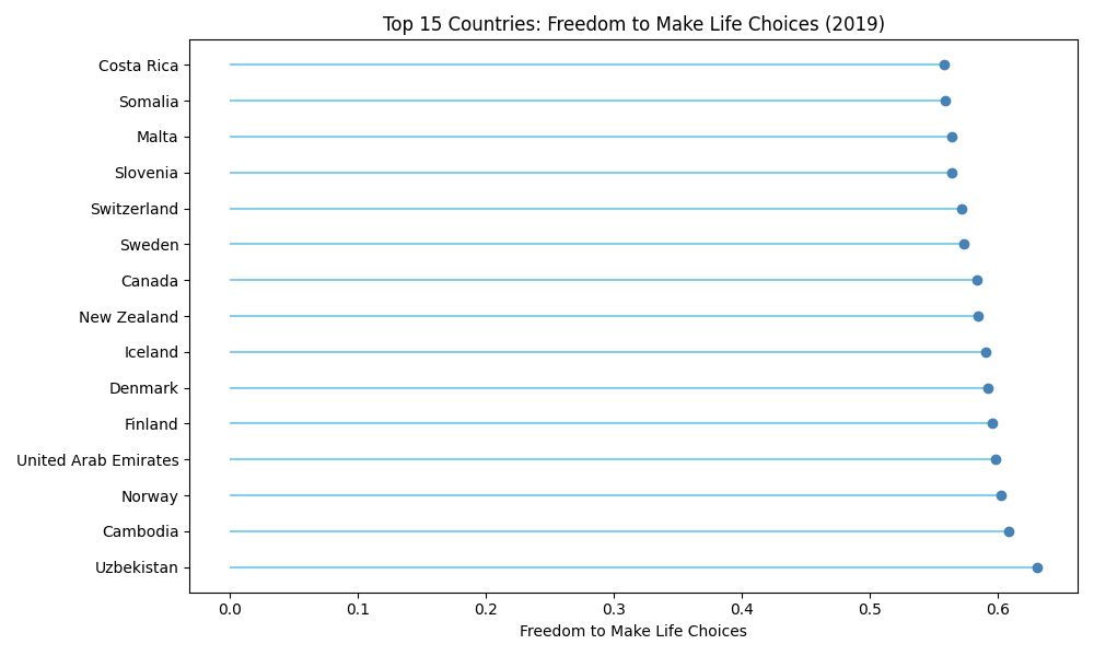
Reading: This column measures self-reported satisfaction with freedom of choice, taken from a single Gallup survey question. It records how people answer about their own lives. It does not measure press freedom, electoral integrity, or civil liberties. Uzbekistan and Cambodia rank high because their respondents report satisfaction with personal choice, not because either country ranks high on institutional freedom indexes.
Norway, Finland, Denmark, and Iceland also appear in the top 15, which is why the mismatch goes unnoticed. Sorting the full column surfaces it immediately.
Generosity
Myanmar leads generosity at 0.566, followed by Indonesia at 0.498 and Haiti at 0.419. Myanmar ranks 131st overall and Haiti ranks 147th.
top_generosity = df[['Country or region', 'Generosity']].sort_values(
    by='Generosity', ascending=False).head(15)

plt.figure(figsize=(10, 6))
plt.hlines(y=top_generosity['Country or region'], xmin=0,
           xmax=top_generosity['Generosity'], color='lightgreen')
plt.plot(top_generosity['Generosity'],
         top_generosity['Country or region'], 'o', color='seagreen')
plt.xlabel('Generosity')
plt.title('Top 15 Countries: Generosity (2019)')
plt.tight_layout()
plt.show()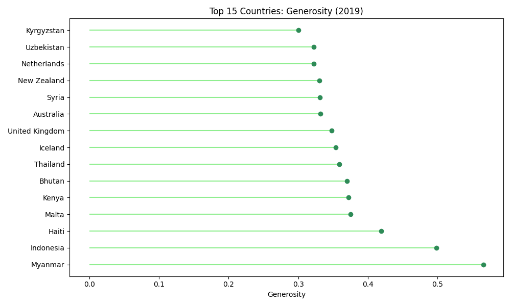
Reading: Generosity tracks charitable donation reported in the past month, adjusted for income. The adjustment removes the wealth effect, which is why low-income countries dominate the top of the column. Iceland at 0.354 and the United Kingdom at 0.348 are the highest-ranked wealthy entries.
Perceptions of corruption
Sorting this column ascending returns Moldova at 0.000, Bulgaria at 0.004, and Afghanistan at 0.025. Those are the countries credited with the fewest score points from institutional trust.
least_trust = df[['Country or region', 'Perceptions of corruption']].sort_values(
    by='Perceptions of corruption').head(15)

plt.figure(figsize=(10, 6))
plt.hlines(y=least_trust['Country or region'], xmin=0,
           xmax=least_trust['Perceptions of corruption'], color='orange')
plt.plot(least_trust['Perceptions of corruption'],
         least_trust['Country or region'], 'o', color='darkorange')
plt.xlabel('Perceptions of Corruption (Higher = More Trust)')
plt.title('Top 15 Countries: Lowest Trust Contribution (2019)')
plt.tight_layout()
plt.show()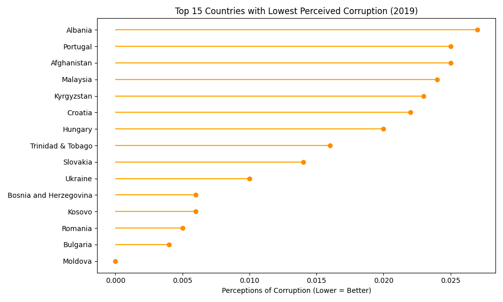
Reading: The chart above carries the title from an earlier draft of this script, which labeled these 15 countries as the least corrupt. That reading inverts the column. In this file a higher value means more trust, because the factor adds points to the happiness score. The correlation between this column and Score is +0.386, a positive relationship.
Sorting descending returns the accurate list of high-trust countries.
most_trust = df[['Country or region', 'Score', 'Perceptions of corruption']].sort_values(
    by='Perceptions of corruption', ascending=False).head(8)
print(most_trust.to_string(index=False))| Country | Score | Perceptions of corruption |
|---|---|---|
| Singapore | 6.262 | 0.453 |
| Rwanda | 3.334 | 0.411 |
| Denmark | 7.600 | 0.410 |
| Finland | 7.769 | 0.393 |
| New Zealand | 7.307 | 0.380 |
| Sweden | 7.343 | 0.373 |
| Switzerland | 7.480 | 0.343 |
| Norway | 7.554 | 0.341 |
Singapore leads the column while ranking 34th overall. Rwanda sits 2nd on trust while ranking 152nd on happiness. Both results confirm that trust contributes to the score independently of the other 5 factors.
Happiness vs. GDP per Capita
GDP per capita correlates with the happiness score at 0.794, the strongest of the 6 factors. A scatter plot with a regression line shows both the trend and the countries that break it.
import matplotlib.pyplot as plt
import seaborn as sns

plt.figure(figsize=(10, 6))
sns.regplot(
    data=df,
    x='GDP per capita',
    y='Score',
    scatter_kws={'alpha': 0.6},
    line_kws={'color': 'red'},
    ci=None
)
plt.xlabel('GDP per Capita')
plt.ylabel('Happiness Score')
plt.title('Happiness Score vs. GDP per Capita (2019)')
plt.tight_layout()
plt.show()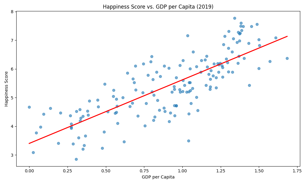
Three patterns in the scatter
- High income, high score: Norway at 1.488 GDP and 7.554 Score, Switzerland at 1.452 and 7.480, Denmark at 1.383 and 7.600.
- High income, mid score: Singapore at 1.572 GDP and 6.262 Score, United Arab Emirates at 1.503 and 6.825. Both post GDP values above Norway while scoring more than 0.7 points lower.
- Low income, spread outcomes: Rwanda at 0.359 GDP scores 3.334. Kyrgyzstan at 0.551 GDP scores 5.261, nearly 2 points higher on comparable income.
Quantifying the relationship
Compute the Pearson correlation directly.
correlation = df['GDP per capita'].corr(df['Score'])
print(f"Correlation between GDP per capita and happiness score: {correlation:.3f}")
Correlation between GDP per capita and happiness score: 0.794A coefficient of 0.794 explains roughly 63 percent of the variance in scores, calculated as r squared. The remaining 37 percent belongs to the other 5 factors and the residual. Income is the single strongest predictor in this file and it accounts for less than two thirds of the outcome.
Which Factors Influence Happiness the Most
A correlation heatmap ranks all 6 factors against the score in one frame. Drop the country column, compute the matrix, and annotate every cell.
import matplotlib.pyplot as plt
import seaborn as sns

numerical_df = df.drop(columns=['Country or region'])
correlation_matrix = numerical_df.corr()

plt.figure(figsize=(10, 8))
sns.heatmap(
    correlation_matrix,
    annot=True,
    cmap='coolwarm',
    fmt='.2f',
    square=True,
    linewidths=0.5,
    cbar_kws={'label': 'Correlation'}
)
plt.title('Correlation Heatmap - World Happiness Report 2019')
plt.tight_layout()
plt.show()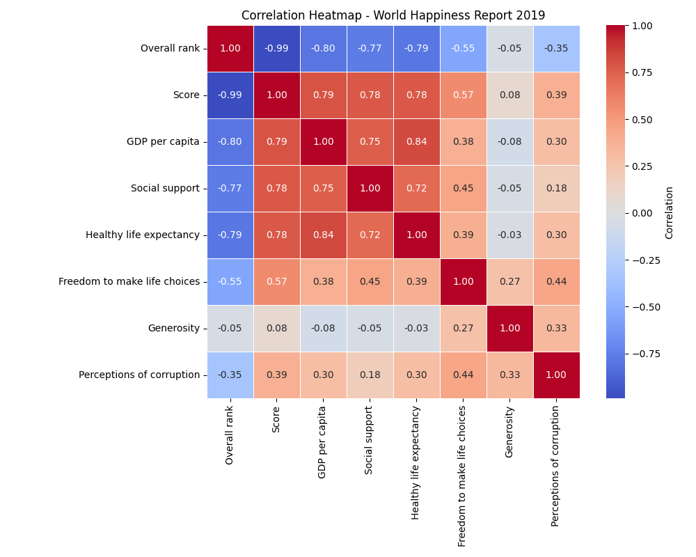
The 6 factors ranked against Score
| Factor | Correlation with Score | Strength |
|---|---|---|
| GDP per capita | 0.794 | Strong positive |
| Healthy life expectancy | 0.780 | Strong positive |
| Social support | 0.777 | Strong positive |
| Freedom to make life choices | 0.567 | Moderate positive |
| Perceptions of corruption | 0.386 | Weak positive |
| Generosity | 0.076 | Effectively none |
This table yields three findings.
The top 3 factors sit within 0.017 of each other. GDP per capita at 0.794, healthy life expectancy at 0.780, and social support at 0.777 form a near-tie. Treating income as the dominant driver overstates a 0.017 gap.
Perceptions of corruption is positive, not negative. The value reads +0.386. Countries credited with more trust score higher. Reporting this factor as a negative correlation reverses the finding.
Generosity is uncorrelated with happiness. At 0.076, generosity carries almost no linear relationship to the score. It correlates more strongly with perceptions of corruption at 0.33 and with freedom at 0.27 than with the outcome itself.
The matrix also shows collinearity among the predictors. GDP per capita and healthy life expectancy correlate at 0.84, and GDP per capita and social support at 0.75. Any regression built on these columns carries multicollinearity that affects coefficient stability. The Python 2SLS Case Study: How Our Expert Helped a Student works through a related identification problem on macro data.
Component Breakdown: Waffle Charts by Region
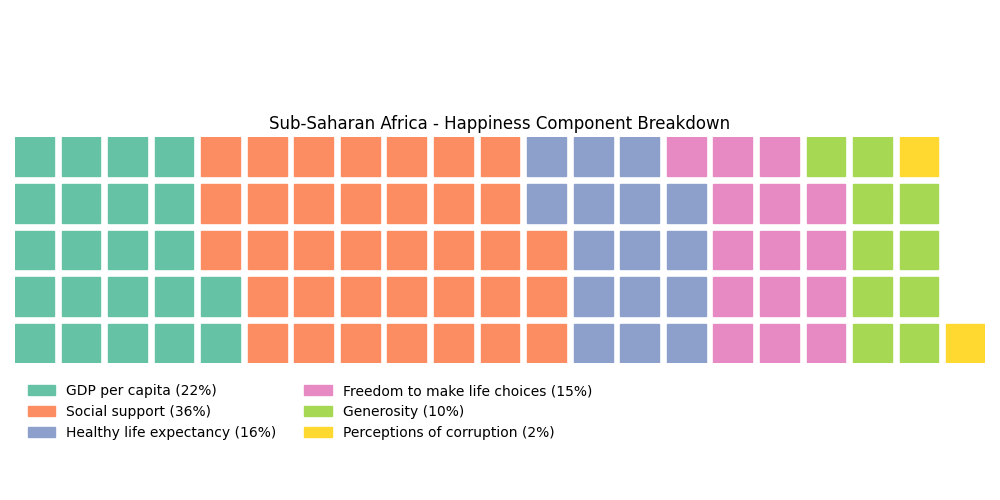
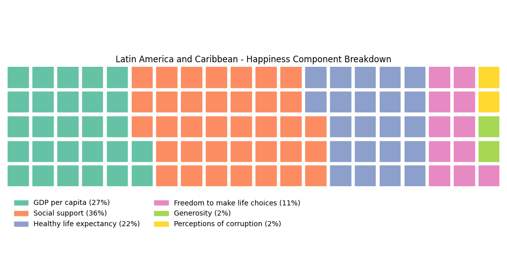
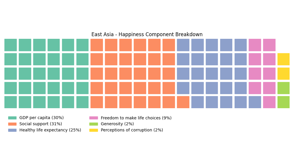
Waffle charts split each region’s average score into the 6 component shares. The 2019 file ships no region column, so the grouping comes from a manual map covering 12 countries across 4 regions.
Step 1: Assign regions
region_map = {
    'Finland': 'Western Europe',
    'Denmark': 'Western Europe',
    'Norway': 'Western Europe',
    'Nigeria': 'Sub-Saharan Africa',
    'Kenya': 'Sub-Saharan Africa',
    'Ghana': 'Sub-Saharan Africa',
    'Brazil': 'Latin America and Caribbean',
    'Mexico': 'Latin America and Caribbean',
    'Argentina': 'Latin America and Caribbean',
    'Japan': 'East Asia',
    'South Korea': 'East Asia',
    'China': 'East Asia'
}

df['Region'] = df['Country or region'].map(region_map)
df_region = df.dropna(subset=['Region'])
print(len(df_region))12Three countries per region is a demonstration sample, not a regional average. Expanding region_map to all 156 countries produces figures that generalize.
Step 2: Compute component shares
components = ['GDP per capita', 'Social support', 'Healthy life expectancy',
              'Freedom to make life choices', 'Generosity', 'Perceptions of corruption']

region_means = df_region.groupby('Region')[components].mean()
region_percentages = region_means.div(region_means.sum(axis=1), axis=0).multiply(100)
Step 3: Draw the waffles
from pywaffle import Waffle
import matplotlib.pyplot as plt

regions_to_plot = ['Western Europe', 'Sub-Saharan Africa',
                   'Latin America and Caribbean', 'East Asia']

for region in regions_to_plot:
    data = region_percentages.loc[region].round().astype(int).to_dict()
    fig = plt.figure(
        FigureClass=Waffle,
        rows=5,
        values=data,
        title={'label': f'{region} - Happiness Component Breakdown', 'loc': 'center'},
        labels=[f"{k} ({v}%)" for k, v in data.items()],
        legend={'loc': 'lower left', 'bbox_to_anchor': (0, -0.4), 'ncol': 2, 'framealpha': 0},
        figsize=(10, 5)
    )
    plt.show()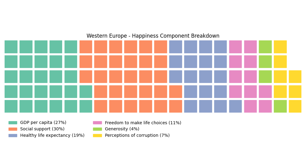
Component shares across the 4 sample groups
| Component share | Western Europe | Sub-Saharan Africa | Latin America | East Asia |
|---|---|---|---|---|
| GDP per capita | 27.0% | 21.9% | 27.2% | 30.1% |
| Social support | 30.4% | 35.7% | 36.0% | 30.9% |
| Healthy life expectancy | 19.3% | 15.8% | 21.8% | 24.8% |
| Freedom | 11.5% | 14.9% | 11.1% | 9.3% |
| Generosity | 4.3% | 10.0% | 2.1% | 2.5% |
| Perceptions of corruption | 7.3% | 1.6% | 1.8% | 2.4% |
| Mean score | 7.641 | 4.923 | 6.327 | 5.657 |
Four contrasts stand out across the sample.
- Western Europe draws 7.3 percent of its total from institutional trust, over 4 times the share of any other group.
- Sub-Saharan Africa draws 10.0 percent from generosity, nearly 5 times the Latin American share, while posting the lowest mean score at 4.923.
- Latin America leans hardest on social support at 36.0 percent and least on generosity at 2.1 percent.
- East Asia carries the highest GDP share at 30.1 percent and the lowest freedom share at 9.3 percent.
Percentage shares describe composition, not level. Sub-Saharan Africa shows the highest generosity share while its mean score trails Western Europe by 2.718 points.
Country-to-Country Comparison
A radar chart plots 5 countries across all 6 factors at once and exposes the different routes to a given score. The comparison covers Finland, the United States, India, Japan, and Brazil.
Step 1: Filter and normalize
Each factor spans a different range, so a radar chart requires normalization before plotting.
from sklearn.preprocessing import MinMaxScaler
import pandas as pd

factors = ['GDP per capita', 'Social support', 'Healthy life expectancy',
           'Freedom to make life choices', 'Generosity', 'Perceptions of corruption']

selected_countries = ['Finland', 'United States', 'India', 'Japan', 'Brazil']
df_compare = df[df['Country or region'].isin(selected_countries)][['Country or region'] + factors]
df_compare = df_compare.set_index('Country or region').loc[selected_countries]

scaler = MinMaxScaler()
df_normalized = pd.DataFrame(scaler.fit_transform(df_compare),
                             columns=factors, index=df_compare.index)
MinMaxScaler fits on these 5 rows only. Every axis reads relative to this group, not to all 156 countries. The lowest of the 5 renders as 0.0 and the highest as 1.0 on each axis.
Step 2: Plot the radar
import matplotlib.pyplot as plt
from math import pi

def plot_radar(data, countries):
    categories = list(data.columns)
    num_vars = len(categories)
    angles = [n / float(num_vars) * 2 * pi for n in range(num_vars)]
    angles += angles[:1]

    plt.figure(figsize=(8, 8))
    ax = plt.subplot(111, polar=True)

    for country in countries:
        values = data.loc[country].tolist()
        values += values[:1]
        ax.plot(angles, values, label=country)
        ax.fill(angles, values, alpha=0.1)

    ax.set_xticks(angles[:-1])
    ax.set_xticklabels(categories, size=10)
    plt.title("Country Comparison Across Happiness Components", size=14)
    plt.legend(loc='upper right', bbox_to_anchor=(1.3, 1.1))
    plt.tight_layout()
    plt.show()

plot_radar(df_normalized, selected_countries)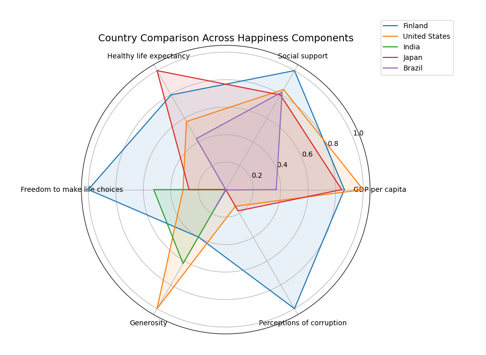
Reading the 5 profiles
| Country | Overall rank | Score | Strongest axis | Weakest axis |
|---|---|---|---|---|
| Finland | 1 | 7.769 | Social support, freedom, trust (all 1.00) | Generosity (0.40) |
| United States | 19 | 6.892 | GDP per capita (1.00), generosity (1.00) | Trust (0.14) |
| Brazil | 32 | 6.300 | Social support (0.82) | Freedom (0.00) |
| Japan | 58 | 5.886 | Healthy life expectancy (1.00) | Generosity (0.00) |
| India | 140 | 4.015 | Generosity (0.62) | GDP, social support, health (0.00) |
The comparison rests on four specifics.
- Finland maxes 3 of the 6 axes and trails the United States on both GDP and generosity. Its raw generosity value is 0.153, below the file mean of 0.185.
- The United States leads the group on income and giving while posting 0.128 on trust, the second lowest of the 5.
- Japan tops healthy life expectancy at a raw 1.088, the highest value in the group, and posts the group’s lowest generosity at 0.069.
- Brazil ranks 32nd on a GDP value of 1.004, roughly 70 percent of Japan’s, by pairing high social support with a low freedom value of 0.390.
Japan and Brazil separate by 26 rank positions on nearly identical social support values, 1.419 against 1.439. The gap comes from freedom and trust, not from support.
Conclusion
Nine visualizations across 156 countries produce 5 durable findings about the World Happiness Report 2019.
- Income, health, and social support tie for first. Their correlations with Score run 0.794, 0.780, and 0.777, a span of 0.017.
- Generosity carries no signal. At 0.076, the factor sits near zero against the outcome despite ranking Myanmar and Indonesia at the top.
- Trust is a positive contributor. Perceptions of corruption correlates at +0.386, and higher values mean more trust in this encoding.
- Freedom measures perception, not institutions. Uzbekistan, Cambodia, and Somalia all appear in the top 15 on that column.
- The distribution is symmetric. Skewness reads +0.011, with mean 5.407 and median 5.380.
The recurring lesson concerns column semantics. Four of the 6 factors carry names that describe a concept while the values encode an estimated contribution to a score. Reading the column name instead of the column definition produced every error corrected in this guide.
The analysis extends in three directions from here. Plotly converts these static charts into hover-and-zoom figures with the same pandas input. Streamlit wraps the whole notebook into a browsable web app in under 100 lines. Expanding region_map from 12 countries to all 156 turns the waffle section from a demonstration into a real regional comparison.
For the plotting fundamentals behind every figure here, read Matplotlib in Python: Plots and Charts. To model this data instead of describing it, start with Machine Learning with Python: A Guide. For the sorting and searching work underneath large dataframe operations, see Efficient Python Algorithms Explained.
Students working through a graded version of this analysis get line-by-line support through our Python Assignment Help and Statistics Homework Help services.
Related articles
-
 Machine Learning
Build a Movie Recommendation System in Python
Build a movie recommender in Python with content-based filtering, collaborative filtering, and a hybrid model, then evaluate it and ship it with Flask.
Jan 27, 2025
-
 Machine Learning
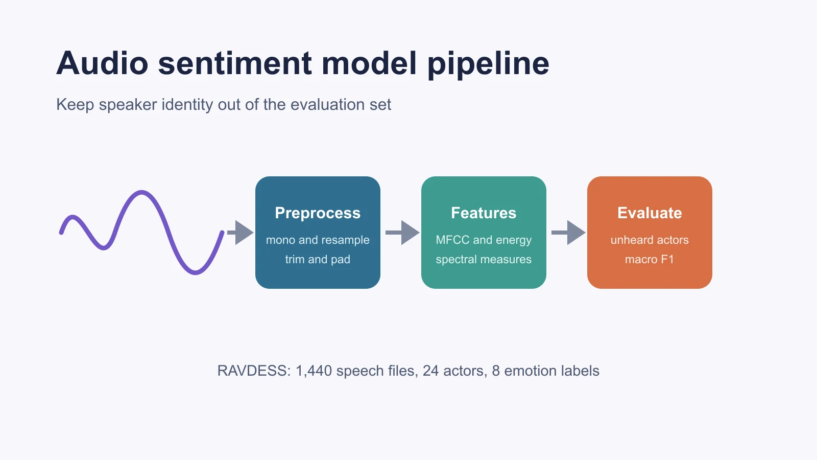
Building a Sentiment Analysis Model With Audio Data
Build and evaluate an audio sentiment model in Python using RAVDESS, librosa features, actor-grouped validation, and honest emotion labels.
Sep 23, 2026
-
 Machine Learning
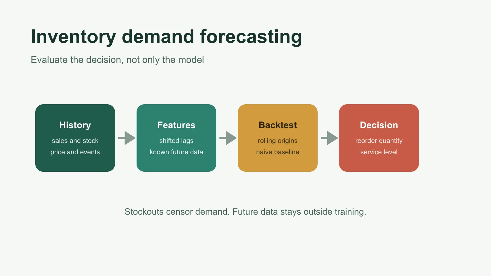
Building an AI-Based Inventory Demand Forecasting Model
Build an inventory demand forecast in Python with leakage-safe lag features, rolling validation, seasonal baselines, practical metrics, and monitoring.
Sep 23, 2026